 0
0
 0
0
Opening a technical document, textbook, or e-book on a mobile device often leads to an immediate user experience dilemma. If the document is formatted as a PDF, opening it on a smartphone screen typically forces the reader into an exhausting cycle of pinching, zooming, and panning horizontally to read a single line of text. Conversely, opening an EPUB file on the same phone allows the typography to adjust smoothly to the screen width, yet complex multi-column data tables or scientific diagrams can become broken or misaligned.
These visual disparities are not random glitches caused by reading applications. They stem from a fundamental architectural divide in digital publishing: Fixed Layout (PDF) versus Reflowable Layout (EPUB). Understanding how these two container formats process vector coordinates, text flows, and viewport boundaries empowers readers, students, and professionals to select the optimal format for their specific hardware and document types.
The mechanics of fixed vs. reflowable layouts
To understand why documents render differently across monitors, tablets, and smartphones, one must examine the underlying structural engine of each file format.
PDF architecture: The fixed vector canvas
Developed by Adobe, the Portable Document Format (PDF) was engineered to replicate physical paper with absolute fidelity. A PDF operates on a fixed vector coordinate system. Every letter, line, shape, and image is anchored to an exact mathematical position on a digital page of predetermined dimensions (typically A4 or US Letter).
Because the page boundaries are rigid, the document renders identically regardless of the software or operating system used to open it. However, when viewed on a small smartphone screen, the reading application has no choice but to shrink the entire fixed page proportionally. This preserves the original visual layout but reduces the typography to microscopic proportions, forcing the user to zoom manually.
EPUB architecture: The fluid HTML/CSS viewport
The Electronic Publication (EPUB) format, maintained by the W3C, operates on an entirely different philosophy derived from web standards. An EPUB file is essentially a zipped package containing XHTML text files, CSS stylesheets, and inline media assets.
Because EPUB relies on responsive web technology, it utilizes a “reflowable” layout engine. The text and images do not have fixed page coordinates. Instead, the rendering engine calculates the exact width and height of the user’s active viewport (screen) and “reflows” the typography dynamically to fit that space. Words wrap seamlessly at the right edge of the screen, allowing smartphone users to read continuously via vertical scrolling or side-swiping without ever zooming.

Format selection based on device screen size
Because each format relies on a distinct rendering engine, matching the file type to your hardware ecosystem significantly improves readability and reduces eye strain.
Here is a practical selection matrix matching device displays, document types, and optimal file formats:
| Device & screen size | Primary document use case | Recommended format | Key UX trade-off |
| Smartphones (4.7″ – 6.7″) | Fiction novels, linear text books, casual reading. | EPUB (Reflowable) | Optimal text wrapping; customizable fonts; complex tables may wrap awkwardly. |
| Compact Tablets & E-Inks (7″ – 8″) | Non-fiction, literature, lightweight manuals. | EPUB or Fixed-EPUB | Excellent portability; adjustable margins; limited canvas for dual-page spreads. |
| Large Tablets & iPads (10″ – 13″) | Academic papers, textbooks, architectural plans. | PDF (Fixed Layout) | Full preservation of dual columns and diagrams; identical to printed paper. |
| Desktop Monitors (21″+) | Multi-page editing, financial reports, blueprints. | PDF (Fixed Layout) | Maximum visual fidelity; ideal for side-by-side document comparison. |
Handling complex media: Images, charts, and data tables
While reflowable text is a blessing for mobile reading, incorporating complex visual media introduces distinct formatting challenges across both ecosystems.
Image rendering and vector scaling
In a fixed PDF layout, images remain permanently anchored adjacent to their corresponding paragraphs. On a small phone screen, however, an embedded architectural blueprint or high-resolution photo is scaled down alongside the page, turning small labels into unreadable pixels unless expanded manually.
In a reflowable EPUB, images are embedded directly within the XHTML text flow using fluid CSS rules (such as max-width: 100%). The image automatically scales to match the physical width of the smartphone screen. While this ensures the photo remains fully visible without manual zooming, it can push an image several “virtual pages” away from its referencing paragraph if the user increases the font size.
The multi-column table challenge
Data tables represent the biggest structural hurdle for reflowable formats. A PDF preserves multi-column financial tables, mathematical formulas, and scientific matrices perfectly because the column widths are locked to absolute coordinates.
In an EPUB, a wide 8-column data table attempts to reflow its text to fit a narrow smartphone screen. This often forces individual table cells to wrap awkwardly, stacking text vertically or clipping outer columns off the right edge of the screen. Reading data-heavy technical reports or financial balance sheets remains significantly more reliable in PDF format.
Reading app adjustments and conversion realities
Modern software developers have built tools to bridge the gap between fixed pages and mobile screens, though file conversion comes with inherent technical limitations.
AI-assisted PDF reflow features (Adobe Liquid Mode)
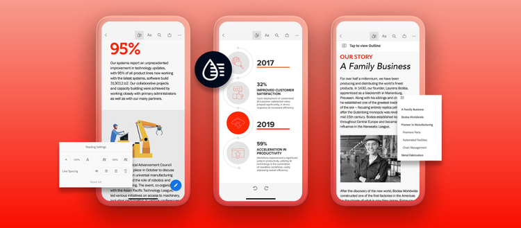
To solve the “pinch-and-zoom” problem without forcing users to convert files, modern reading applications utilize AI-driven reflow engines. Adobe Acrobat’s Liquid Mode is a prime example. Liquid Mode uses artificial intelligence to scan a static PDF, identify headings, paragraphs, images, and tables, and dynamically generate a responsive mobile text view on the fly. This allows users to read fixed PDFs on smartphones with adjustable font sizes while retaining the ability to toggle back to the original layout at any time.
Conversion limitations between PDF and EPUB
When users attempt to convert a PDF into an EPUB file using automated software (like Calibre or online converters), the results are often mixed. Because PDFs do not contain native paragraph tags—only absolute coordinate points—conversion engines must “guess” where paragraphs begin and end. This frequently results in broken line breaks, merged running headers, misplaced page numbers embedded in the middle of sentences, and garbled mathematical equations. Simple text-based PDFs convert well, but complex graphical layouts should rarely be converted.


